The PanelList Object


The PanelList control creates rows of panels much like a ListBox except each panel may contain a variety of child controls arranged in any order on a panel and, if the control is data-centric, it can be bound to a column. Multiple objects bound to columns on a panel form a set of columns (called a ColSet) that can be populated with data.
Using the PanelList Control
Simply set the number of panels you will need in the Panels property using the + or - buttons.
Each click of the + button adds a PanelRow object which can then be stylized and used to hold other controls.
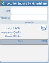
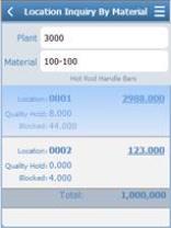
The PanelList and PanelRows can be treated as templates that will contain the data from a database so that at runtime, your application can have specific areas (i.e. PanelList) dedicated for static information (Plant Name & Location), and PanelRow1 dedicated to the presentation of data from multiple records (Different categories of Items, inventory counts and bin locations), and another PanelRow dedicated to the presentation of total counts for all records totaled in PanelRow2. So at runtime, the user could see the static information, multiple panels (one for each record), and a total count as the final panel.
When designing the app, the ActivePanel property is used to display the PanelRow you want to work with. For example, if you added 3 panels, the designer will add 3 child PanelRow objects as PanelRow1, PanelRow2, and PanelRow3. If you only wanted to work on the design of PanelRow2, then you would set the ActivePanel property to PanelRow2.
The PageMode property if set to True, the panel row will become the full size of the PanelList, and the user will be able to swipe horizontally to the view the panel row data.
You can also use the Control Properties dropdown menu to select the PanelRow you want to design.
When you add child controls such as a label or textbox to a PanelRow, the BindToColumn property in the Lable or TextBox controls displays. Use the BindToColumn property to set the control to specific column in the PanelList or a specific PanelRow. Note that columns are added via VBA Language Extensions in the script view of the app.
The ListOptions property group is used to stylize the panels (treated as rows) and how the rows are displayed before they are selected.
The ListOptions, FilterMode property is a search feature that will allow you to enter filter criteria and if matched, it hides the rows that don't match the filter entries.
The ListOptions. SortMode property group specifies the desired sort order for the specified column.
The RowStyles property group offers many ways for listing, selecting and displaying how the row looks when it displays and when its pressed (selected). For example, if you want to have a sidebar appear for a selected panel, set ShowNode to True. To allow the row to be highlighted using a color of your choice, set ShowNode to False.
The other properties in the PanelList and PanelRows are similar to those used in other controls.
For property descriptions, see Graphical Control Properties.